Pixel fonts tend to look better in 88x31s, especially when displayed as pixel art on Hi-DPI displays. A quick and easy way to get pixelated fonts is to open a Windows XP VM and pick a font in notepad. https://int10h.org/oldschool-pc-fonts/ has a few fonts used in DOS terminals. You can also recreate fonts from other old operating systems, steal the Minecraft font like I did, or make your own font by hand!
If using rendered fonts (OS rendering or image editor rendering), it may be worth manually kerning them to make them look better. On the left is the button for eightyeightthirty.one directly using from aseprite’s “Insert Text” feature. On the right is after my manual adjustments. Notice the “ght” at the end is very cramped.
An example of a font recreation from an OS: I remade the font used in SGI IRIX’s title windows for Winter’s 88x31
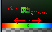
Shift hue and saturation when shading
When shading colors, I like to use this technique I learned from Jappa (The texture designer for Minecraft). Adjusting hue or saturation as well as brightness when shading can help make shading look more natural.
[…] For more interesting colors you should shift the hue everytime you go darker, you can go either left or right, whatever feels better. […]
Dithering gradients can give a nice retro effect to your 88x31
Borders
Borders aren’t always necesary, but they help make your artwork feel “contained”, I guess.
I just like borders okay, be fancy and creative with them
image-rendering: pixelated
On Hi-DPI displays, or when zoomed in, 88x31s can appear blurry. A way to prevent this is to set image rendering to pixelated. Most mobile phones have Hi-DPI, so it’s definitely worth doing.